
Bridgestone & Firestone
Web Experience Design
User Experience Lead / 2020-21
Project Overview
We were asked to rethink the web experience for one of the largest and most well known tire brands in the world. The existing sites suffered from an aging codebase and a non-optimal user experience. The user couldn’t purchase from the site, but instead had to locate a dealer once they found a tire for their vehicle - a process that was cumbersome and took many steps. This project had lots of opportunities for user experience improvements.

UX Strategy
Through our upfront discovery work and insights gained from conducting user testing on the existing sites and 1:1 interviews with consumers, an audit and benchmark of competitors, and other inputs, we mapped out a user journey to inform our UX design strategy and opportunities for the project ahead.
Formative Usability Testing
We got real user feedback on existing site and competitor sites to highlight areas of friction and opportunity for design solutions.
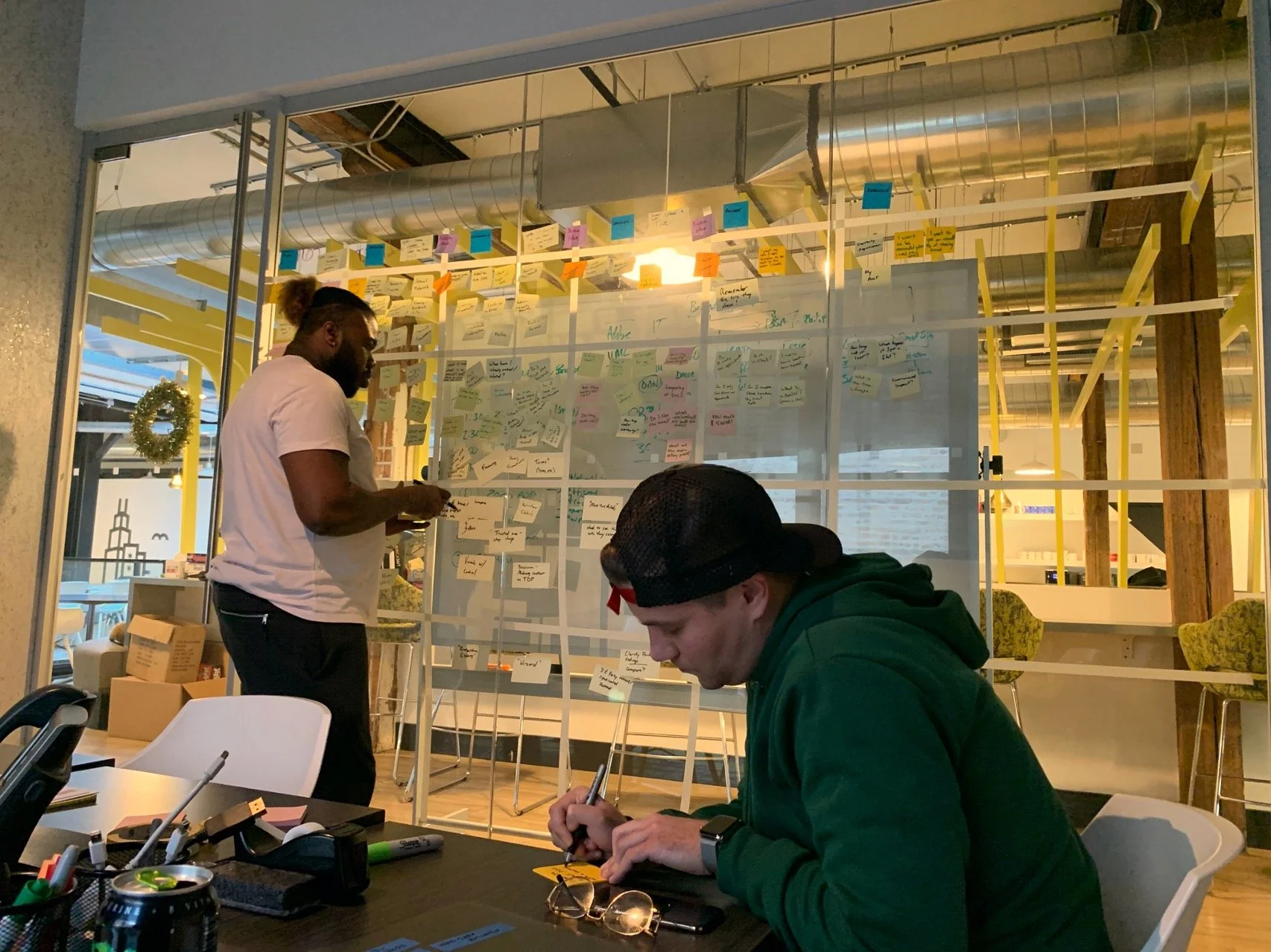
User Journey Mapping Session
After we gathered insights about our users and the phases of their journey we mapped out their goals, information needs, and other ways the website can support their path to purchase.
The Challenge
The sites serve a consumer audience but do not have e-comm capability so the main business KPI was getting the user to find a tire result and subsequently find a partner dealer at which to purchase the tire. Previously the user needed to take many steps in order for them to find a dealer where the tire was available, resulting in a low conversion rate. The new website experience shortened the amount of steps drastically (from 8 to 3).
The sites were built on Adobe AEM platform, enabling personalization of components based on various things we know about the user. Our tire buyer journey showed that users don’t one-stop-shop for tires, they often visit many websites over days, weeks, or longer before deciding where to ultimately purchase.
the Solution
UX Design
Having gained a well rounded understanding of our users and opportunities for improvement and innovation we set out to begin the UX design phase. Before jumping into site architecture we started with identifying and plotting key user flows.
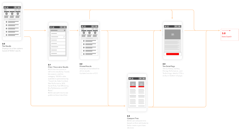
Key User Flows
We mapped out the most important intent cases that a user would come to the sites to accomplish. We were able to identify flow optimizations early on.
Sitemaps
The proposed architecture kept important user actions like searching for tires and finding a dealer highly visible. We were also able to streamline the experience by doing away with unnecessary pages such as a secondary tire catalog page that only confused users and added extra steps to the flow. Organic traffic was a large consideration of the site architecture design as well.

Wireframes
Homepage
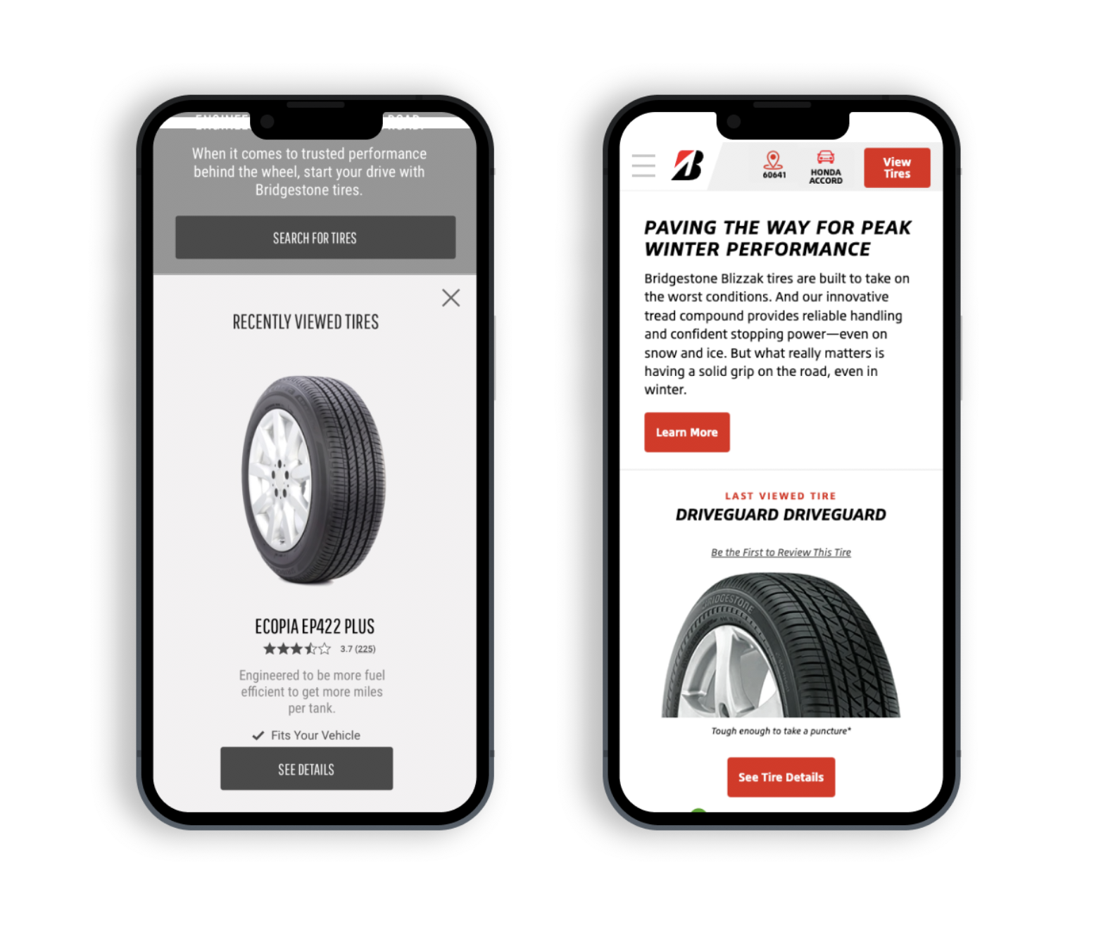
Our website offered different experiences for new and returning users. New users are encouraged to immediately add a vehicle, so the site can adapt to showing them what’s relevant to their fit as they browse the site. When a user returns, they’re shown an alternate experience where they see their last viewed tire and can quickly pick up where they left off.
Tire Carousel
Once a user entered their vehicle we would personalize the products shown to them based on what would fit for them since some do not. Products that fit would reorder to be shown first. A UI element visually confirms fit for every tire once a vehicle is entered.


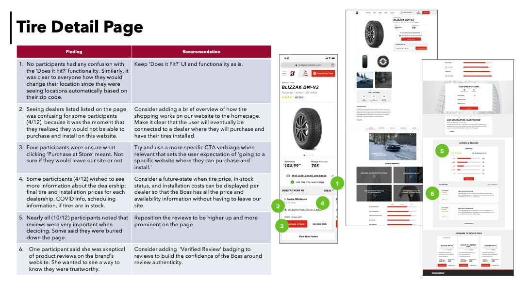
Tire Detail Page
Tire detail pages also reassure the user by confirming fit for their vehicle. In the event that the tire doesn’t fit, the user is guided back to see tire results that do fit. Tire dealers near the user automatically display on the page showing the user possible locations to purchase and install the tires that fit their vehicle.
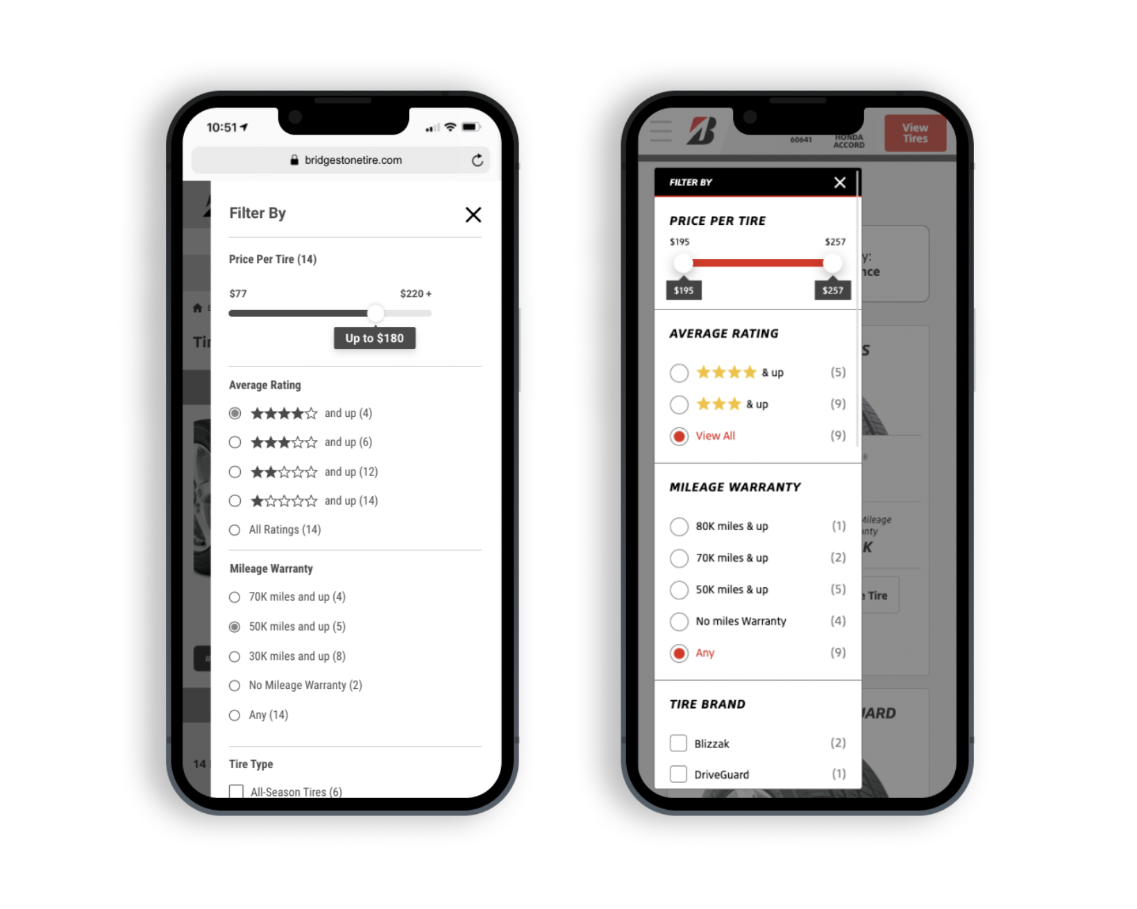
Tire Filter
We designed a much more robust and user friendly way of filtering tire results. The user can filter by price, rating, mileage warranty, tire type, or attribute.
Tire Results Page
Based on our research showing that users want a guiding hand when seeing tire results we designed a top 3 recommendation area at the top of the page. This area uses back-end logic to match the user with tires that are particularly well suited for their vehicle, location, and other information that we know about them. There are more tires below if they would like to see all of the options.

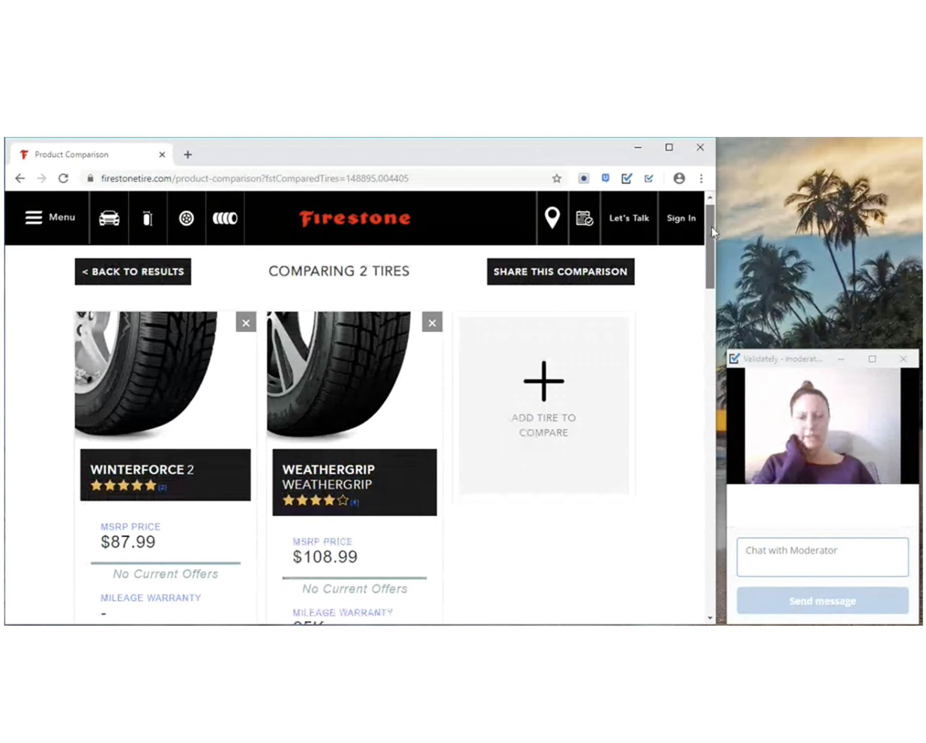
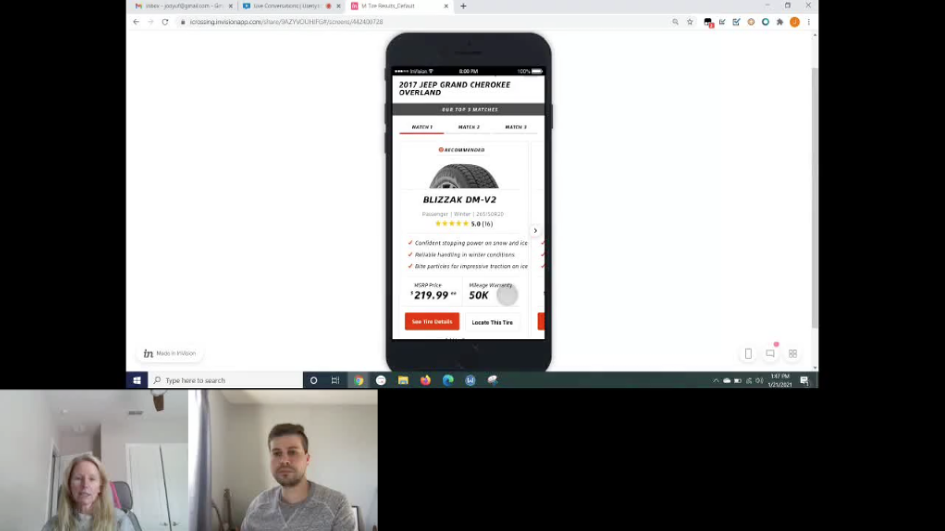
Concept Usability Testing
After creating visual designed pages based off of the client-approved wireframes, we conducted usability testing to identify any areas of friction that should be resolved prior to development. We created a findings and recommendations document where we outlined possible fixes for issues we identified. We worked with the client and rest of our team to decide on what items would be addressed and updated prior to beginning development.
Outcome
After the sites launched we saw an impressive improvement in our main site KPIs. Organic traffic increased by over 25%. Dealer basket transfers increased by over 50%. We continue to fine tune the site through ongoing optimizations and multivariate testing.